If you are interested to learn about the React MEMO
There are many ways to style React with CSS, this tutorial will take a closer look at three common ways:
- Inline styling
- CSS stylesheets
- CSS Modules
- Styled Components
Inline Styling
To style an element with the inline style attribute, the value must be a JavaScript object:
Example:
Insert an object with the styling information:
const Header = () => {
  return (
    <>
      <h1 style={{color: "red"}}>Hello Style!</h1>
      <p>Add a little style!</p>
    </>
  );
}
Note: In JSX, JavaScript expressions are written inside curly braces, and since JavaScript objects also use curly braces, the styling in the example above is written inside two sets of curly braces {{}}.
came Cased Property Names
Since the inline CSS is written in a JavaScript object, properties with hyphen separators, like background-color, must be written with camel case syntax:
Example:
Use backgroundColor instead of background-color:
const Header = () => {
  return (
    <>
      <h1 style={{backgroundColor: "lightblue"}}>Hello Style!</h1>
      <p>Add a little style!</p>
    </>
  );
}
JavaScript Object
You can also create an object with styling information, and refer to it in the style attribute:
Example:
Create a style object named myStyle:
const Header = () => {
  const myStyle = {
    color: "white",
    backgroundColor: "DodgerBlue",
    padding: "10px",
    fontFamily: "Sans-Serif"
  };
  return (
    <>
      <h1 style={myStyle}>Hello Style!</h1>
      <p>Add a little style!</p>
    </>
  );
}
CSS Stylesheet
You can write your CSS styling in a separate file, just save the file with the .css file extension, and import it in your application.
App.css:
Create a new file called “App.css” and insert some CSS code in it:
body {
  background-color: #282c34;
  color: white;
  padding: 40px;
  font-family: Sans-Serif;
  text-align: center;
}
Note: You can call the file whatever you like, just remember the correct file extension.
Import the stylesheet in your application:
index.js:
import React from 'react';
import ReactDOM from 'react-dom/client';
import './App.css';

const Header = () => {
  return (
    <>
      <h1>Hello Style!</h1>
      <p>Add a little style!.</p>
    </>
  );
}

const root = ReactDOM.createRoot(document.getElementById('root'));
root.render(<Header />);
CSS Modules
Another way of adding styles to your application is to use CSS Modules. CSS Modules are convenient for components that are placed in separate files. The CSS inside a module is available only for the component that imported it, and you do not have to worry about name conflicts. Create the CSS module with the .module.css extension, example: my-style.module.css. Create a new file called “my-style.module.css” and insert some CSS code in it:
my-style.module.css:
.bigblue {
  color: DodgerBlue;
  padding: 40px;
  font-family: Sans-Serif;
  text-align: center;
}
Import the stylesheet in your component:
Car.js:
import styles from './my-style.module.css';

const Car = () => {
  return <h1 className={styles.bigblue}>Hello Car!</h1>;
}

export default Car;
Import the component in your application:
index.js:
import ReactDOM from 'react-dom/client';
import Car from './Car.js';

const root = ReactDOM.createRoot(document.getElementById('root'));
root.render(<Car />);
4. Styled Components
Styled-components is a library for React. It uses enhance CSS for styling React component systems in your application, which is written with a mixture of JavaScript and CSS.
The styled-components provides:
- Automatic critical CSS
- No class name bugs
- Easier deletion of CSS
- Simple dynamic styling
- Painless maintenance
Installation
The styled-components library takes a single command to install in your React application. which is:
$ npm install styled-components --save Example
Here, we create a variable by selecting a particular HTML element such as <div>, <Title>, and <paragraph> where we store our style attributes. Now we can use the name of our variable as a wrapper <Div></Div> kind of React component.
import React from 'react';
import ReactDOM from 'react-dom';
import styled from 'styled-components';
class App extends React.Component {
render() {
const Div:any = styled.div`
margin: 20px;
border: 5px dashed green;
&:hover {
background-color: ${(props:any) => props.hoverColor};
}
`;
const Title = styled.h1`
font-family: Arial;
font-size: 35px;
text-align: center;
color: palevioletred;
`;
const Paragraph = styled.p`
font-size: 25px;
text-align: center;
background-Color: lightgreen;
`;
return (
<div>
<Title>Styled Components Example</Title>
<p></p>
<Div hoverColor="Orange">
<Paragraph>Hello JavaTpoint!!</Paragraph>
</Div>
</div>
);
}
}
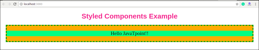
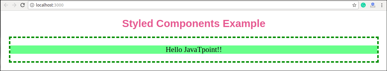
export default App; Output
Now, execute the App.js file, we will get the output as shown below.
When we move the mouse pointer over the image, its color will be changed, as shown in the below image.