
If you are interested to learn about the AngularJS Events
Forms in AngularJS provides data-binding and validation of input controls. AngularJS facilitates you to create a form enriches with data binding and validation of input controls. Input controls are ways for a user to enter data. A form is a collection of controls for the purpose of grouping related controls together.
Input Controls
Input controls are the HTML input elements:
- input elements
- select elements
- button elements
- textarea elements
Data-Binding
Input controls provides data-binding by using the ng-model directive.
<input type="text" ng-model="firstname">
The application does now have a property named firstname. The ng-model directive binds the input controller to the rest of your application. The property firstname, can be referred to in a controller:
Example
<script>
var app = angular.module('myApp', []);
app.controller('formCtrl', function($scope) {
  $scope.firstname = "John";
});
</script>
It can also be referred to elsewhere in the application:
Example
<form>
  First Name: <input type="text" ng-model="firstname">
</form>

<h1>You entered: {{firstname}}</h1>
Checkbox
A checkbox has the value true or false. Apply the ng-model directive to a checkbox, and use its value in your application.
Example
Show the header if the checkbox is checked:
 <form>
  Check to show a header:
  <input type="checkbox" ng-model="myVar">
</form>

<h1 ng-show="myVar">My Header</h1>
Radiobuttons
Bind radio buttons to your application with the ng-model directive. Radio buttons with the same ng-model can have different values, but only the selected one will be used.
Example
Display some text, based on the value of the selected radio button:
<form>
  Pick a topic:
  <input type="radio" ng-model="myVar" value="dogs">Dogs
  <input type="radio" ng-model="myVar" value="tuts">Tutorials
  <input type="radio" ng-model="myVar" value="cars">Cars
</form>
The value of myVar will be either dogs, tuts, or cars.
Selectbox
Bind select boxes to your application with the ng-model directive. The property defined in the ng-model attribute will have the value of the selected option in the selectbox.
Example
Display some text, based on the value of the selected option:
<form>
  Select a topic:
  <select ng-model="myVar">
    <option value="">
    <option value="dogs">Dogs
    <option value="tuts">Tutorials
    <option value="cars">Cars
  </select>
</form>
The value of myVar will be either dogs, tuts, or cars.
An AngularJS Form Example
First Name:
Last Name:
RESET
form = {“firstName”:”John”,”lastName”:”Doe”}
master = {“firstName”:”John”,”lastName”:”Doe”}
Application Code
<div ng-app="myApp" ng-controller="formCtrl">
  <form novalidate>
    First Name:<br>
    <input type="text" ng-model="user.firstName"><br>
    Last Name:<br>
    <input type="text" ng-model="user.lastName">
    <br><br>
    <button ng-click="reset()">RESET</button>
  </form>
  <p>orm = {{user}}</p>
 master = {{master}}</p>
</div>

<script>
var app = angular.module('myApp', []);
app.controller('formCtrl', function($scope) {
  $scope.master = {firstName: "John", lastName: "Doe"};
  $scope.reset = function() {
    $scope.user = angular.copy($scope.master);
  };
Example Explained
The ng-app directive defines the AngularJS application.
The ng-controller directive defines the application controller.
The ng-model directive binds two input elements to the user object in the model.
The formCtrl controller sets initial values to the master object, and defines the reset() method.
The reset() method sets the user object equal to the master object.
The ng-click directive invokes the reset() method, only if the button is clicked.
The novalidate attribute is not needed for this application, but normally you will use it in AngularJS forms, to override standard HTML5 validation.
Simple form
The key directive in understanding two-way data-binding is ngModel. The ngModel directive provides the two-way data-binding by synchronizing the model to the view, as well as view to the model. In addition it provides an API for other directives to augment its behavior.
<div ng-controller="ExampleController">
  <form novalidate class="simple-form">
    <label>Name: <input type="text" ng-model="user.name" /></label><br />
    <label>E-mail: <input type="email" ng-model="user.email" /></label><br />
    Best Editor: <label><input type="radio" ng-model="user.preference" value="vi" />vi</label>
    <label><input type="radio" ng-model="user.preference" value="emacs" />emacs</label><br />
    <input type="button" ng-click="reset()" value="Reset" />
    <input type="submit" ng-click="update(user)" value="Save" />
  </form>
  <pre>user = {{user | json}}
  <pre>master = {{master | json}


angular.module('formExample', [])
    .controller('ExampleController', ['$scope', function($scope) {
      $scope.master = {};

      $scope.update = function(user) {
        $scope.master = angular.copy(user);
      };

      $scope.reset = function() {
        $scope.user = angular.copy($scope.master);
      };
Note that novalidate is used to disable browser’s native form validation.
The value of ngModel won’t be set unless it passes validation for the input field. For example: inputs of type email must have a value in the form of user@domain.
Using CSS classes
To allow styling of form as well as controls, ngModel adds these CSS classes:
ng-valid: the model is validng-invalid: the model is invalidng-valid-[key]: for each valid key added by$setValidityng-invalid-[key]: for each invalid key added by$setValidityng-pristine: the control hasn’t been interacted with yetng-dirty: the control has been interacted withng-touched: the control has been blurredng-untouched: the control hasn’t been blurredng-pending: any$asyncValidatorsare unfulfilled
The following example uses the CSS to display validity of each form control. In the example both user.name and user.email are required, but are rendered with red background only after the input is blurred (loses focus). This ensures that the user is not distracted with an error until after interacting with the control, and failing to satisfy its validity.
<div ng-controller="ExampleController">
  <form novalidate class="css-form">
    <label>Name: <input type="text" ng-model="user.name" required /></label><br />
    <label>E-mail: <input type="email" ng-model="user.email" required /></label><br />
    Gender: <label><input type="radio" ng-model="user.gender" value="male" />male</label>
    <label><input type="radio" ng-model="user.gender" value="female" />female</label><br />
    <input type="button" ng-click="reset()" value="Reset" />
    <input type="submit" ng-click="update(user)" value="Save" />
  </form>
  <pre>user = {{user | json}}</pre>
  <pre>master = {{master | json}}</pre>
</div>

<style type="text/css">
  .css-form input.ng-invalid.ng-touched {
    background-color: #FA787E;
  }

  .css-form input.ng-valid.ng-touched {
    background-color: #78FA89;
  }
</style>

<script>
  angular.module('formExample', [])
    .controller('ExampleController', ['$scope', function($scope) {
      $scope.master = {};

      $scope.update = function(user) {
        $scope.master = angular.copy(user);
      };

      $scope.reset = function() {
        $scope.user = angular.copy($scope.master);
      };

      $scope.reset();
    }]);
</script>
Binding to form and control state
A form is an instance of FormController. The form instance can optionally be published into the scope using the name attribute. Similarly, an input control that has the ngModel directive holds an instance of NgModelController. Such a control instance can be published as a property of the form instance using the name attribute on the input control. The name attribute specifies the name of the property on the form instance.
This implies that the internal state of both the form and the control is available for binding in the view using the standard binding primitives. This allows us to extend the above example with these features:
- Custom error message displayed after the user interacted with a control (i.e. when
$touchedis set) - Custom error message displayed upon submitting the form (
$submittedis set), even if the user didn’t interact with a control
<div ng-controller="ExampleController">
  <form name="form" class="css-form" novalidate>
   Name:
      <input type="text" ng-model="user.name" name="uName" required=""


   ng-show="form.$submitted || form.uName.$touched">
       ng-show="form.uName.$error.required">Tell us your name.


   E-mail:
      <input type="email" ng-model="user.email" name="uEmail" required="" />

    <div ng-show="form.$submitted || form.uEmail.$touched">
      <span ng-show="form.uEmail.$error.required">Tell us your email.
      <span ng-show="form.uEmail.$error.email">This is not a valid email.


    Gender:
   input type="radio" ng-model="user.gender" value="male" />male
    <input type="radio" ng-model="user.gender" value="female" />female
    <br />
    <label>
    <input type="checkbox" ng-model="user.agree" name="userAgree" required="" />

    I agree:
    </label>
    <input ng-show="user.agree" type="text" ng-model="user.agreeSign" required="" />
    <br />
    <div ng-show="form.$submitted || form.userAgree.$touched">
      <div ng-show="!user.agree || !user.agreeSign">Please agree and sign.</div>
    </div>

    <input type="button" ng-click="reset(form)" value="Reset" />
    <input type="submit" ng-click="update(user)" value="Save" />
  </form>
  <pre>user = {{user | json}}</pre>
  <pre>master = {{master | json}}</pre>
</div>
Custom model update triggers
By default, any change to the content will trigger a model update and form validation. You can override this behavior using the ng ModelOptions directive to bind only to specified list of events. I.e. ng-model-options="{ updateOn: 'blur' }" will update and validate only after the control loses focus. You can set several events using a space delimited list. I.e. ng-model-options="{ updateOn: 'mousedown blur' }"
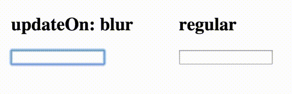
If you want to keep the default behavior and just add new events that may trigger the model update and validation, add “default” as one of the specified events.
ng-model-options="{ updateOn: 'default blur' }"The following example shows how to override immediate updates. Changes on the inputs within the form will update the model only when the control loses focus (blur event).
<div ng-controller="ExampleController">
  <form>
    <label>Name:
      <input type="text" ng-model="user.name" ng-model-options="{ updateOn: 'blur' }" /></label><br />
    <label>
    Other data:
    <input type="text" ng-model="user.data" /></label><br />
  </form>
  <pre>username = "{{user.name}}"</pre>
  <pre>userdata = "{{user.data}}"</pre>
</div>
Non-immediate (debounced) model updates
You can delay the model update/validation by using the debounce key with the ngModelOptions directive. This delay will also apply to parsers, validators and model flags like $dirty or $pristine.
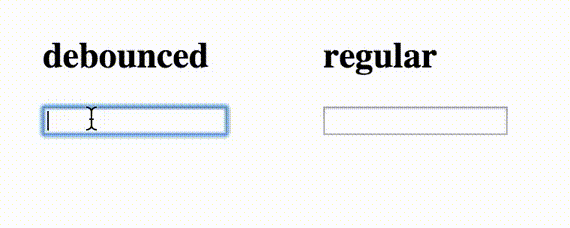
I.e. ng-model-options="{ debounce: 500 }" will wait for half a second since the last content change before triggering the model update and form validation. If custom triggers are used, custom debouncing timeouts can be set for each event using an object in debounce. This can be useful to force immediate updates on some specific circumstances (like blur events).
ng-model-options="{ updateOn: 'default blur', debounce: { default: 500, blur: 0 } }"If those attributes are added to an element, they will be applied to all the child elements and controls that inherit from it unless they are overridden. This example shows how to debounce model changes. Model will be updated only 250 milliseconds after last change.
<div ng-controller="ExampleController">
  <form>
    <label>Name:
    <input type="text" ng-model="user.name" ng-model-options="{ debounce: 250 }" /></label><br />
  </form>
  <pre>username = "{{user.name}}"</pre>
</div>
Custom Validation
AngularJS provides basic implementation for most common HTML5 input types: (text, number, url, email, date, radio, checkbox), as well as some directives for validation (required, pattern, minlength, maxlength, min, max).
With a custom directive, you can add your own validation functions to the $validators object on the ngModelController. To get a hold of the controller, you require it in the directive as shown in the example below.
Each function in the $validators object receives the modelValue and the viewValue as parameters. AngularJS will then call $setValidity internally with the function’s return value (true: valid, false: invalid). The validation functions are executed every time an input is changed ($setViewValue is called) or whenever the bound model changes. Validation happens after successfully running $parsers and $formatters, respectively. Failed validators are stored by key in ngModelController.$error.
Additionally, there is the $asyncValidators object which handles asynchronous validation, such as making an $http request to the backend. Functions added to the object must return a promise that must be resolved when valid or rejected when invalid. In-progress async validations are stored by key in ngModelController.$pending.
In the following example we create two directives:
- An
integerdirective that validates whether the input is a valid integer. For example,1.23is an invalid value, since it contains a fraction. Note that we validate the viewValue (the string value of the control), and not the modelValue. This is because input[number] converts the viewValue to a number when running the$parsers. - A
usernamedirective that asynchronously checks if a user-entered value is already taken. We mock the server request with a$qdeferred.
<form name="form" class="css-form" novalidate>
  <div>
    <label>
    Size (integer 0 - 10):
    <input type="number" ng-model="size" name="size"
           min="0" max="10" integer />{{size}}</label><br />
    <span ng-show="form.size.$error.integer">The value is not a valid integer!</span>
    <span ng-show="form.size.$error.min || form.size.$error.max">
      The value must be in range 0 to 10!</span>
  </div>

  <div>
    <label>
    Username:
    <input type="text" ng-model="name" name="name" username />{{name}}</label><br />
    <span ng-show="form.name.$pending.username">Checking if this name is available...</span>
    <span ng-show="form.name.$error.username">This username is already taken!</span>
  </div>

</form>
Modifying built-in validators
Since AngularJS itself uses $validators, you can easily replace or remove built-in validators, should you find it necessary. The following example shows you how to overwrite the email validator in input[email] from a custom directive so that it requires a specific top-level domain, example.com to be present. Note that you can alternatively use ng-pattern to further restrict the validation.
<form name="form" class="css-form" novalidate>
  <div>
    <label>
      Overwritten Email:
      <input type="email" ng-model="myEmail" overwrite-email name="overwrittenEmail" />
    </label>
    <span ng-show="form.overwrittenEmail.$error.email">This email format is invalid!</span><br>
    Model: {{myEmail}}
    </div>
</form>
Implementing custom form controls (using ngModel)
AngularJS implements all of the basic HTML form controls (input, select, textarea), which should be sufficient for most cases. However, if you need more flexibility, you can write your own form control as a directive.
In order for custom control to work with ngModel and to achieve two-way data-binding it needs to:
- implement
$rendermethod, which is responsible for rendering the data after it passed theNgModelController.$formatters, - call
$setViewValuemethod, whenever the user interacts with the control and model needs to be updated. This is usually done inside a DOM Event listener.
<div contentEditable="true" ng-model="content" title="Click to edit">Some</div>
<pre>model = {{content}}</pre>

<style type="text/css">
  div[contentEditable] {
    cursor: pointer;
    background-color: #D0D0D0;
  }
</style>
