
If you are interested to learn about the React Conditional Rendering
In React, you will render lists with some type of loop. The JavaScript map() array method is generally the preferred method. Lists are used to display data in an ordered format and mainly used to display menus on websites. In React, Lists can be created in a similar way as we create lists in JavaScript. If you need a refresher on the map() method, check out the ES6 section. The map() function is used for traversing the lists. In the below example, the map() function takes an array of numbers and multiply their values with 5. We assign the new array returned by map() to the variable multiply Nums and log it.
Example:
Let’s render all of the cars from our garage:
function Car(props) {
  return <li>I am a { props.brand }</li>;
}

function Garage() {
  const cars = ['Ford', 'BMW', 'Audi'];
  return (
    <>
      <h1>Who lives in my garage?</h1>
      <ul>
        {cars.map((car) => <Car brand={car} />)}
      </ul>
    </>
  );
}

const root = ReactDOM.createRoot(document.getElementById('root'));
root.render(<Garage />);
Keys
Keys allow React to keep track of elements. This way, if an item is updated or removed, only that item will be re-rendered instead of the entire list. Keys need to be unique to each sibling. But they can be duplicated globally. Generally, the key should be a unique ID assigned to each item. As a last resort, you can use the array index as a key.
Example:
Let’s refactor our previous example to include keys:
function Car(props) {
  return <li>I am a { props.brand }</li>;
}

function Garage() {
  const cars = [
    {id: 1, brand: 'Ford'},
    {id: 2, brand: 'BMW'},
    {id: 3, brand: 'Audi'}
  ];
  return (
    <>
      <h1>Who lives in my garage?</h1>
      <ul>
        {cars.map((car) => <Car key={car.id} brand={car.brand} />)}
      </ul>
    </>
  );
}

const root = ReactDOM.createRoot(document.getElementById('root'));
root.render(<Garage />);
Example
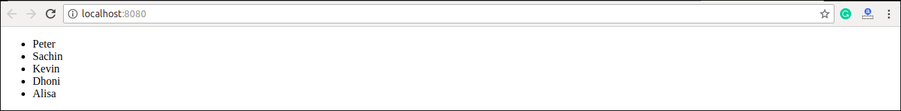
import React from 'react';
import ReactDOM from 'react-dom';

const myList = ['Peter', 'Sachin', 'Kevin', 'Dhoni', 'Alisa'];
const listItems = myList.map((myList)=>{
    return <li>{myList}</li>;
});
ReactDOM.render(
    <ul> {listItems} </ul>,
    document.getElementById('app')
);
export default App;
Output
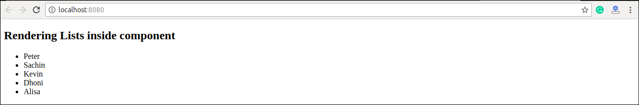
Rendering Lists inside components
In the previous example, we had directly rendered the list to the DOM. But it is not a good practice to render lists in React. In React, we had already seen that everything is built as individual components. Hence, we would need to render lists inside a component. We can understand it in the following code.
Example
import React from 'react';
import ReactDOM from 'react-dom';

function NameList(props) {
  const myLists = props.myLists;
  const listItems = myLists.map((myList) =>
    <li>{myList}</li>
  );
  return (
    <div>
        <h2>Rendering Lists inside component</h2>
              <ul>{listItems}</ul>
    </div>
  );
}
const myLists = ['Peter', 'Sachin', 'Kevin', 'Dhoni', 'Alisa'];
ReactDOM.render(
  <NameList myLists={myLists} />,
  document.getElementById('app')
);
export default App;
Output
actions
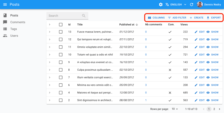
You can replace the list of default actions by your own elements using the actions prop:
import {
    TopToolbar,
    FilterButton,
    CreateButton,
    ExportButton,
    Button,
    List
} from 'react-admin';
import IconEvent from '@mui/icons-material/Event';

const ListActions = () => (
    <TopToolbar>
        <FilterButton/>
        <CreateButton/>
        <ExportButton/>
        {/* Add your custom actions */}
        <Button
            onClick={() => { alert('Your custom action'); }}
            label="Show calendar"
        >
            <IconEvent/>
        </Button>
    </TopToolbar>
);

export const PostList = () => (
    <List actions={<ListActions/>}>
        ...
    </List>
);
Use the useListContext hook to customize the actions depending on the list context, and the usePermissions to show/hide buttons depending on permissions. For example, you can hide the <CreateButton> when the user doesn’t have the right permission, and disable the <ExportButton> when the list is empty:
import {
    useListContext,
    usePermissions,
    TopToolbar,
    FilterButton,
    CreateButton,
    ExportButton,
    List
} from 'react-admin';
import IconEvent from '@mui/icons-material/Event';

const ListActions = () => {
    const { total, isLoading } = useListContext();
    const { permissions } = usePermissions();
    return (
        <TopToolbar>
            <FilterButton />
            {permissions === "admin" && <CreateButton/>}
            <ExportButton disabled={isLoading || total === 0} />
        </TopToolbar>
    );
}
aside: Side Component
You may want to display additional information on the side of the list. Use the aside prop for that, passing the component of your choice:
const Aside = () => (
    <div style={{ width: 200, margin: '1em' }}>
        <Typography variant="h6">Post details</Typography>
        <Typography variant="body2">
            Posts will only be published once an editor approves them
        </Typography>
    </div>
);

const PostList = () => (
    <List aside={<Aside />}>
        ...
    </List>
);
The aside component can call the useListContext() hook to receive the same props as the List child component. This means you can display additional details of the current list in the aside component:
import { Typography } from '@mui/material';
import { useListContext } from 'react-admin';

const Aside = () => {
    const { data, isLoading } = useListContext();
    if (isLoading) return null;
    return (
        <div style={{ width: 200, margin: '1em' }}>
            <Typography variant="h6">Posts stats</Typography>
            <Typography variant="body2">
                Total views: {data.reduce((sum, post) => sum + post.views, 0)}
            </Typography>
        </div>
    );
};
