If you are interested to learn about the CSS Background
The CSS border is a shorthand property used to set the border on an element. The CSS border properties are use to specify the style, color and size of the border of an element.
I have borders on all sides.I have a red bottom border.I have rounded borders.I have a blue left border.CSS Border Style
The border-style property specifies what kind of border to display. The following values are allowed:
dotted– Defines a dotted borderdashed– Defines a dashed bordersolid– Defines a solid borderdouble– Defines a double bordergroove– Defines a 3D grooved border. The effect depends on the border-color valueridge– Defines a 3D ridged border. The effect depends on the border-color valueinset– Defines a 3D inset border. The effect depends on the border-color valueoutset– Defines a 3D outset border. The effect depends on the border-color valuenone– Defines no borderhidden– Defines a hidden border
The border-style property can have from one to four values (for the top border, right border, bottom border, and the left border).
Example
Demonstration of the different border styles:
p.dotted {border-style: dotted;}
p.dashed {border-style: dashed;}
p.solid {border-style: solid;}
p.double {border-style: double;}
p.groove {border-style: groove;}
p.ridge {border-style: ridge;}
p.inset {border-style: inset;}
p.outset {border-style: outset;}
p.none {border-style: none;}
p.hidden {border-style: hidden;}
p.mix {border-style: dotted dashed solid double;}
Result:
A dotted border.

A dashed border.

A solid border.

A double border.

A groove border. The effect depends on the border-color value.

A ridge border. The effect depends on the border-color value.

An inset border. The effect depends on the border-color value.

An outset border. The effect depends on the border-color value.

No border.

A hidden border.

A mixed border.
2) CSS border-width
The border-width property is used to set the border’s width. It is set in pixels. You can also use the one of the three pre-defined values, thin, medium or thick to set the width of the border.
Note: The border-width property is not used alone. It is always used with other border properties like “border-style” property to set the border first otherwise it will not work.
<!DOCTYPE html>
<html>
<head>
<style>
p.one {
    border-style: solid;
    border-width: 5px;
}
p.two {
    border-style: solid;
    border-width: medium;
}
p.three {
    border-style: solid;
    border-width: 1px;
}
</style>
</head>
<body>
<p class="one">Write your text here.</p>
<p class="two">Write your text here.</p>
<p class="three">Write your text here.</p>
</body>
</html>
3) CSS border-color
There are three methods to set the color of the border.
volume is gedempt
- Name: It specifies the color name. For example: “red”.
- RGB: It specifies the RGB value of the color. For example: “rgb(255,0,0)”.
- Hex: It specifies the hex value of the color. For example: “#ff0000”.
There is also a border color named “transparent”. If the border color is not set it is inherited from the color property of the element.
Note: The border-color property is not used alone. It is always used with other border properties like “border-style” property to set the border first otherwise it will not work.
<!DOCTYPE html>
<html>
<head>
<style>
p.one {
    border-style: solid;
    border-color: red;
}
p.two {
    border-style: solid;
    border-color: #98bf21;
}
</style>
</head>
<body>
<p class="one">This is a solid red border</p>
<p class="two">This is a solid green border</p>
</body>
</html>
CSS border-radius property
This CSS property sets the rounded borders and provides the rounded corners around an element, tags, or div. It defines the radius of the corners of an element.
It is shorthand for border top-left-radius, border-top-right-radius, border-bottom-right-radius and border-bottom-left-radius. It gives the rounded shape to the corners of the border of an element. We can specify the border for all four corners of the box in a single declaration using the border-radius. The values of this property can be defined in percentage or length units.
This CSS property includes the properties that are tabulated as follows:
| Property | Description |
|---|---|
| border-top-left-radius | It is used to set the border-radius for the top-left corner |
| border-top-right-radius | It is used to set the border-radius for the top-right corner |
| border-bottom-right-radius | It is used to set the border-radius for the bottom-right corner |
| border-bottom-left-radius | It is used to set the border-radius for the bottom-left corner |
If the bottom-left value is omitted, then it will be same as the top-right. If the value of bottom-right is eliminated, then it will be same as the top-left. Similarly, if top-right is eliminated, then it will be the same as top-left.xhttps://imasdk.googleapis.com/js/core/bridge3.544.0_en.html#goog_982124607
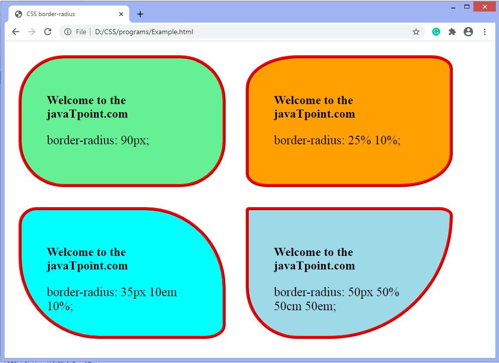
Let’s see what happens when we provide a single value, two values, three values, and four values to this property.
- If we provide a single value (such as border-radius: 30px;) to this property, it will set all corners to the same value.
- When we specify two values (such as border-radius: 20% 10% 😉, then the first value will be used for the top-left and bottom-right corners, and the second value will be used for the top-right and bottom-left corners.
- When we use three values (such as border-radius: 10% 30% 20%;) then the first value will be used for the top-left corner, the second value will be applied on top-right, and bottom-left corners and the third value will be applied to the bottom-right corner.
- Similarly, when this property has four values (border-radius: 10% 30% 20% 40%;) then the first value will be the radius of top-left, the second value will be used for the top-right, the third value will be applied on bottom-right, and the fourth value is used for bottom-left.
Syntax
border-radius: 1-4 length | % / 1-4 length | % | inherit | initial; Property values
length: It defines the shape of the corners. It denotes the size of the radius using length values. Its default value is 0. It does not allow negative values.
percentage: It denotes the size of the radius in percentage. It also does not allow negative values.
Example
<!DOCTYPE html>
<html>

<head>
<title> CSS border-radius </title>
<style>
div {
padding: 50px;
margin: 20px;
border: 6px ridge red;
width: 300px;
float: left;
height: 150px;
}
p{
font-size: 25px;
}
#one {
border-radius: 90px;
background: lightgreen;
}
#two {
border-radius: 25% 10%;
background: orange;
}
#three {
border-radius: 35px 10em 10%;
background: cyan;
}
#four {
border-radius: 50px 50% 50cm 50em;
background: lightblue;
}

</style>
</head>

<body>
<div id = "one">
<h2> Welcome to the javaTpoint.com </h2>
<p> border-radius: 90px; </p>
</div>
<div id = "two">
<h2> Welcome to the javaTpoint.com </h2>
<p> border-radius: 25% 10%; </p>
</div>
<div id = "three">
<h2> Welcome to the javaTpoint.com </h2>
<p> border-radius: 35px 10em 10%; </p>
</div>
<div id = "four">
<h2>Welcome to the javaTpoint.com</h2>
<p>border-radius: 50px 50% 50cm 50em;</p>
</div>
</body>
</html>
Output
Now, let’s see the border-radius for specific corners.
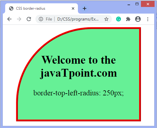
Example- border-top-left-radius
It sets the border radius for the top-left corner.
<!DOCTYPE html>
<html>

<head>
<title> CSS border-radius </title>
<style>
#left {
border-top-left-radius: 250px;
background: lightgreen;
padding: 50px;
border: 6px ridge red;
width: 300px;
height: 200px;
font-size: 25px;
}
</style>
</head>

<body>
<center>
<div id = "left">
<h2>Welcome to the javaTpoint.com</h2>
<p>border-top-left-radius: 250px;</p>
</div>
</center>
</body>
</html>
Output
CSS border-collapse property
This CSS property is used to set the border of the table cells and specifies whether the table cells share the separate or common border. This property has two main values that are separate and collapse. When it is set to the value separate, the distance between the cells can be defined using the border-spacing property. When the border-collapse is set to the value collapse, then the inset value of border-style property behaves like groove, and the outset value behaves like ridge.
Syntax
border-collapse: separate | collapse | initial | inherit; The values of this CSS property are defined as follows.
Property Values
separate: It is the default value that separates the border of the table cell. Using this value, each cell will display its own border.Play Videox
collapse: This value is used to collapse the borders into a single border. Using this, two adjacent table cells will share a border. When this value is applied, the border-spacing property does not affect.
initial: It sets the property to its default value.
inherit: It inherits the property from its parent element.
Now, let’s understand this CSS property by using some examples. In the first example, we are using the separate value of the border-collapse property. In the second example, we are using the collapse value of the border-collapse property.
Example – Using separate value
With this value, we can use the border-spacing property to set the distance between the adjacent table cells.
<!DOCTYPE html>
<html>

<head>
<title> border-collapse property </title>
<style>
table{
border: 2px solid blue;
text-align: center;
font-size: 20px;
width: 80%;
height: 50%;
}
th{
border: 5px solid red;
background-color: yellow;
}
td{
border: 5px solid violet;
background-color: cyan;
}
#t1 {
border-collapse: separate;
}
</style>
</head>

<body>

<h1> The border-collapse Property </h1>
<h2> border-collapse: separate; </h2>
<table id = "t1">
<tr>
<th> First_Name </th>
<th> Last_Name </th>
<th> Subject </th>
<th> Marks </th>
</tr>
<tr>
<td> James </td>
<td> Gosling </td>
<td> Maths </td>
<td> 92 </td>
</tr>
<tr>
<td> Alan </td>
<td> Rickman </td>
<td> Maths </td>
<td> 89 </td>
</tr>
<tr>
<td> Sam </td>
<td> Mendes </td>
<td> Maths </td>
<td> 82 </td>
</tr>
</table>
</body>

</html>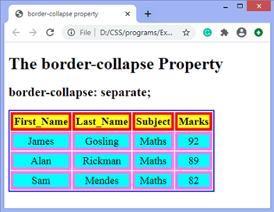
CSS border-spacing property
This CSS property is used to set the distance between the borders of the adjacent cells in the table. It applies only when the border-collapse property is set to separate. There will not be any space between the borders if the border-collapse is set to collapse.
It can be defined as one or two values for determining the vertical and horizontal spacing.
- When only one value is specified, then it sets both horizontal and vertical spacing.
- When we use the two-value syntax, then the first one is used to set the horizontal spacing (i.e., the space between the adjacent columns), and the second value sets the vertical spacing (i.e., the space between the adjacent rows).
Syntax
border-spacing: length | initial | inherit; Property Values
The values of this CSS property are defined as follows.
length: This value sets the distance between the borders of the adjacent table cells in px, cm, pt, etc. Negative values are not allowed.Play Videox
initial: It sets the property to its default value.
inherit: It inherits the property from its parent element.
Let’s understand this CSS property by using some examples. In the first example, we are using the single value of the border-spacing property, and in the second example, we are using two values of the border-spacing property.
Example
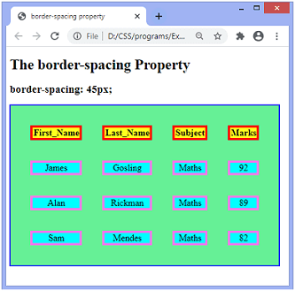
Here, we are using the single value of the border-spacing property. The border-collapse property is set to separate, and the value of the border-spacing is set to 45px.
<!DOCTYPE html>
<html>

<head>
<title> border-spacing property </title>
<style>
table{
border: 2px solid blue;
text-align: center;
font-size: 20px;
background-color: lightgreen;
}
th{
border: 5px solid red;
background-color: yellow;
}
td{
border: 5px solid violet;
background-color: cyan;
}
#space{
border-collapse: separate;
border-spacing: 45px;
}
</style>
</head>

<body>

<h1> The border-spacing Property </h1>
<h2> border-spacing: 45px; </h2>
<table id = "space">
<tr>
<th> First_Name </th>
<th> Last_Name </th>
<th> Subject </th>
<th> Marks </th>
</tr>
<tr>
<td> James </td>
<td> Gosling </td>
<td> Maths </td>
<td> 92 </td>
</tr>
<tr>
<td> Alan </td>
<td> Rickman </td>
<td> Maths </td>
<td> 89 </td>
</tr>
<tr>
<td> Sam </td>
<td> Mendes </td>
<td> Maths </td>
<td> 82 </td>
</tr>
</table>
</body>

</html>