If you are interested to learn about the React unit testing
React Carousel is a slideshow component for cycling by elements ? slides of pictures or text ? like a carousel.
How does it work?
React Carousel is a slideshow inside a bunch of content. It launches many images, text, or HTML elements and supports previous/next buttons. The Page Visibility API is cross-browser compatible and prevents carousel scrolling when the user is not viewing a webpage (such as when the browser tab is inactive, the browser window is minimized, etc.).
It is a powerful, lightweight and fully customizable carousel component for React applications.Play Video
Installing as a package
- yarn add react-responsive-carousel
Usage
import React, { Component } from 'react';
import ReactDOM from 'react-dom';
import "react-responsive-carousel/lib/styles/carousel.min.css"; // requires a loader
import { Carousel } from 'react-responsive-carousel';

class DemoCarousel extends Component {
    render() {
        return (
            <Carousel>
                <div>
                    <img src="assets/1.jpeg" />
                    <p className="legend">Legend 1</p>
                </div>
                <div>
                    <img src="assets/2.jpeg" />
                    <p className="legend">Legend 2</p>
                </div>
                <div>
                    <img src="assets/3.jpeg" />
                    <p className="legend">Legend 3</p>
                </div>
            </Carousel>
        );
    }
});
Props:
| Name | Value | Description |
|---|---|---|
| ariaLabel | string | Defines the area-label attribute for the root carousel element. By excluding the attribute from the markup, the default is undefined. |
| axis | ‘horizontal’, ‘vertical’ | Set the direction of the slider, ‘Horizontal,’ by default. |
| autoFocus | boolean | Focus on the Carousel while rendering. |
| autoPlay | boolean | Automatically change slide based on interval prop. |
| centerMode | boolean | Center the current item and set the width of the slide based on centerSlidePercentage. |
| centerSlidePercentage | number | Set the width percentage relative to the carousel width when centerMode is true. |
| dynamicHeight | boolean | The height of the objects will not be fixed. |
| emulateTouch | boolean | Enables swipe right on non-touch screens when swipeable. |
| infiniteLoop | boolean | Going after the last item will go back to the first slide. |
| interval | number | To skip to the next item automatically, the interval in milliseconds when autoplay is true is 3000 by default. |
| labels | object | Apply region labels to a carousel with an object with LeftArrow, RightArrow, and Item properties. |
| onClickItem | function | The default is {left arrow: ‘previous slide/item’, right arrow: ‘next slide/item’, item: ‘slide item’}. |
| onClickThumb | function | A callback to handle a click event on the thumb receives the current index and item as arguments. |
| onChange | function | The callback gets the current index and item as arguments each time the selected item changes to handle. |
| onSwipeStart | function | The callback is handled when a touch event initiates the swipe as an argument. |
| onSwipeEnd | function | To handle when the swipe is finished, the callback receives a touch event as an argument. |
| onSwipeMove | function | The callback is triggered on every movement while swiping, receiving a touch event as an argument. |
| preventMovementUntilSwipeScrollTolerance | boolean | Do not let the carousel scroll until the user swipes to the value specified on SwipeScrollTolerance. |
| renderArrowPrev | function | Render custom back arrow. Receives a click handler, a boolean indicating whether there is a previous item, and an accessibility label as an argument. |
| renderArrowNext | function | Render custom back arrow. Receives a click handler, a boolean indicating where the following item is, and an accessibility label as an argument. |
| renderIndicator | function | Current custom indicator. Receives a click handler, a boolean indicating whether the item is selected, the item index, and an accessibility label as arguments. |
| renderItem | function | Submit a custom item. Get an item from the Carousel and an object with the selected property as an argument. |
| renderThumbs | function | Render prop to show thumb, receives carousel item as argument. Get the image tag of each item of the slider, and render it by default. |
| selectedItem | number | Set the selected item, default to 0. |
| showArrows | boolean | Enable Previous and Next arrows, True by default. |
| showStatus | boolean | Enable the current item’s absolute position, which is confirmed by default |
| showIndicators | boolean | Enable the indicator to select an item, which defaults to true. |
| showThumbs | boolean | Enable thumbs, defaults to true. |
| statusFormatter | function | Formatter that returns the position as a string gets the current item and takes the total count as an argument. Defaults to {currentItem} of the format {total}. |
| stopOnHover | boolean | The slide cannot change by autoplay on hover. Default to true. |
| swipeable | boolean | Enable the user to swipe the Carousel, which defaults to true. |
| swipeScrollTolerance | number | The number of pixels needed to slide a slide is five by default when swiping. |
| thumbWidth | number | Thumb width, 80 by default. |
| transitionTime | number | The duration of the slide change animation. |
| useKeyboardArrows | boolean | Enable arrows to move the slider when focused. |
| verticalSwipe | ‘natural’, ‘standard’ | Set swipe mode when the axis is ‘vertical.’ The default is ‘Standard.’ |
| width | number or string | The width of the Carousel is 100% by default. |
Customizing
Items (Slides)
By default, each slide is rendered as passed as children. If we need to customize it, use the prop renderItem.
- renderItem: (item: React.ReactNode, options?{ isSelected: boolean }) => React.ReactNode;
Thumbs
By default, thumbs are generated by extracting images in each slide. If you don’t have pictures on your slides or prefer a different thumbnail, use the renderThumb method to return a new list of images to be used as thumbnails.
renderThumbs: (children: React.ReactChild[]) => React.ReactChild[]
Arrows
By default, simple arrows are provided on each side. If you need to customize them and css isn’t enough, use renderArrowPrev and renderArrowNext. The click handler is passed as an argument to the prop and must be added to the custom arrow as the click handler.
renderArrowPrev: (clickHandler: () => void, hasPrev: boolean, label: string) => React.ReactNode;
renderArrowNext: (clickHandler: () => void, hasNext: boolean, label: string) => React.ReactNode;
Indicators
By default, the indicators will be presented as those tiny little dots at the bottom of the carousel. To customize them, use the RenderIndicator prop.
renderIndicator: (
    clickHandler: (e: React.MouseEvent | React.KeyboardEvent) => void,
    isSelected: boolean,
    index: number,
    label: string
) => React.ReactNode;
Take full control of the carousel
If none of the previous options suffice, you can create your controls for the Carousel.
Custom Animations
By default, Carousel uses traditional ‘slide’ style animations. There is also a built-in fade animation, which is used by passing ‘fade’ to the AnimationHandler prop.
*Note: The ‘fade’ animation may not support swiping animations, so you may want to set swipeable to false.
If you want something completely custom, you can pass custom animation handler functions to AnimationHandler, SwipeAnimationHandler, and StopSwipingHandler. Animation handler functions accept props and positions and return the styles for the list, the default slide style, the selected slide style, and the previous slide style. Take a look at the fade animation handlers to get an idea of how they work:
const fadeAnimationHandler: AnimationHandler = (props, state): AnimationHandlerResponse => {
    const transitionTime = props.transitionTime + 'ms';
    const transitionTimingFunction = 'ease-in-out';

    let slideStyle: React.CSSProperties = {
        position: 'absolute',
        display: 'block',
        zIndex: -2,
        minHeight: '100%',
        opacity: 0,
        top: 0,
        right: 0,
        left: 0,
        bottom: 0,
        transitionTimingFunction: transitionTimingFunction,
        msTransitionTimingFunction: transitionTimingFunction,
        MozTransitionTimingFunction: transitionTimingFunction,
        WebkitTransitionTimingFunction: transitionTimingFunction,
        OTransitionTimingFunction: transitionTimingFunction,
    };

    if (!state.swiping) {
        slideStyle = {
            ...slideStyle,
            WebkitTransitionDuration: transitionTime,
            MozTransitionDuration: transitionTime,
            OTransitionDuration: transitionTime,
            transitionDuration: transitionTime,
            msTransitionDuration: transitionTime,
        };
    }

    return {
        slideStyle,
        selectedStyle: { ...slideStyle, opacity: 1, position: 'relative' },
        prevStyle: { ...slideStyle },
    };
}; 
<CCarousel>
 <CCarouselItem>
<CImage className="d-block w-100" src="/images/react.jpg" alt="slide 1" />
</CCarouselItem>
 <CCarouselItem>
 <CImage className="d-block w-100" src="/images/vue.jpg" alt="slide 2" />
</CCarouselItem>
<CCarouselItem>
<CImage className="d-block w-100" src="/images/angular.jpg" alt="slide 3" />
</CCarouselItem>
</CCarousel>
With controls
It will add in the previous and next controls by controls property.

<CCarousel controls>
<CCarouselItem>
   <CImage className="d-block w-100" src="/images/react.jpg" alt="slide 1" />
  </CCarouselItem>
  <CCarouselItem>
  <CImage className="d-block w-100" src="/images/vue.jpg" alt="slide 2" />
</CCarouselItem>
<CCarouselItem>
    <CImage className="d-block w-100" src="/images/angular.jpg" alt="slide 3" />
  </CCarouselItem>
</CCarousel>
With indicators
You can also attach the indicators to the Carousel lengthwise and the controls.

<CCarousel controls indicators>
<CCarouselItem>
    <CImage className="d-block w-100" src="/images/react.jpg" alt="slide 1" />
  </CCarouselItem>
  <CCarouselItem>
    <CImage className="d-block w-100" src="/images/vue.jpg" alt="slide 2" />
</CCarouselItem>
<CCarouselItem>
<CImage className="d-block w-100" src="/images/angular.jpg" alt="slide 3" />
  </CCarouselItem>
</CCarousel>
With captions
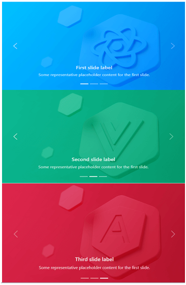
You can add captions to slides in any <CCarouselItem> with the <CCarouselCaption> element. Optional display utilities can be quickly hidden on a small viewport, as shown below. We hide them with .d-none and pull them back on medium-sized devices with .d-MD-block.
Some representative placeholder content for the first slide.
<CCarousel controls indicators>
  <CCarouselItem>
    <CImage className="d-block w-100" src="/images/react.jpg" alt="slide 1" />
   <CCarouselCaption className="d-none d-md-block">
     <h5>First slide label</h5>
</CCarouselCaption>
</CCarouselCaption>
</CCarouselItem>
<CCarouselItem>
  <CImage className="d-block w-100" src="/images/vue.jpg" alt="slide 2" />
    <CCarouselCaption className="d-none d-md-block">
<h5>Second slide label</h5>
      <p>Some representative placeholder content for the first slide.</p>
 </CCarouselCaption>
  </CCarouselItem>
  <CCarouselItem>
    <CImage className="d-block w-100" src="/images/angular.jpg" alt="slide 3" />
    <CCarouselCaption className="d-none d-md-block">
      <h5>Third slide label</h5>
      <p>Some representative placeholder content for the first slide.</p>
   </CCarouselCaption>
</CCarouselItem>
</CCarousel>
Crossfade
the carousel to animate slides with a fade transition instead of a slide.
<CCarousel controls transition="crossfade">
<CCarouselItem>
   <CImage className="d-block w-100" src="/images/react.jpg" alt="slide 1" />
  </CCarouselItem>
  <CCarouselItem>
    <CImage className="d-block w-100" src="/images/vue.jpg" alt="slide 2" />
</CCarouselItem>
<CCarouselItem>
   <CImage className="d-block w-100" src="/images/angular.jpg" alt="slide 3" />
  </CCarouselItem>
</CCarousel>
Dark variant
Add a dark property to the CCrocell for dark color controls, indicators, and captions. Controls with the Filter CSS property are reversed from their default white fill, and captions and controls have additional Sass variables that customize the color and background color.
Some representative placeholder content for the first slide.
<CCarousel controls indicators dark>
  <CCarouselItem>
    <CImage className="d-block w-100" src="/images/react.jpg" alt="slide 1" />
   <CCarouselCaption className="d-none d-md-block">
      <h5>First slide label</h5>
    <p>Some representative placeholder content for the first slide.</p>
</CCarouselCaption>
  </CCarouselItem>
  <CCarouselItem>
   <CImage className="d-block w-100" src="/images/vue.jpg" alt="slide 2" />
    <CCarouselCaption className="d-none d-md-block">
      <h5>Second slide label</h5>
      <p>Some representative placeholder content for the first slide.</p>
  </CCarouselCaption>
  </CCarouselItem>
<CCarouselItem>
  <CImage className="d-block w-100" src="/images/angular.jpg" alt="slide 3" />
    <CCarouselCaption className="d-none d-md-block">
      <h5>Third slide label</h5>
     <p>Some representative placeholder content for the first slide.</p>
  </CCarouselCaption>
</CCarouselItem>
</CCarousel>
API
CCarousel
import { CCarousel } from '@coreui/react'

// or

import CCarousel from '@coreui/react/src/components/carousel/CCarousel' | Property | Description | Type | Default |
|---|---|---|---|
| activeIndex | Index of the active object. | number | 0 |
| className | A string of all the classnames you want to apply to the parent component. | string | – |
| controls | Adding to previous and next controls. | boolean | – |
| dark | Add darker controls, indicators, and captions. | boolean | – |
| indicators | Adding indicators at the bottom of the Carousel for each item. | boolean | – |
| interval | The amount of time for the delay between automatically cycling an item. If false, the Carousel will not cycle automatically. | number | boolean | 5000 |
| onSlid | The callback is fired when a slide transition is finished. | (active: number, direction: string) => void | – |
| onSlide | The callback is fired when a slide transition is initiated. | (active: number, direction: string) => void | – |
| pause | If set to ‘hover,’ pauses cycling of the Carousel on mouseenter and resumes cycling of the Carousel on mouseleave. If set to false, hovering over the Carousel will not stop it. | boolean | ‘hover.’ | hover |
| transition | Set the transition type. | ‘slide’ | ‘crossfade’ | – |
| wrap | Set whether the Carousel must be cycled continuously or have a hard stop. | boolean | true |
| Property | Description | Type | Default |
|---|---|---|---|
| activeIndex | Index of the active object. | number | 0 |
| className | A string of all the classnames you want to apply to the parent component. | string | – |
| controls | Adding to previous and next controls. | boolean | – |
| dark | Add darker controls, indicators, and captions. | boolean | – |
| indicators | Adding indicators at the bottom of the Carousel for each item. | boolean | – |
| interval | The amount of time for the delay between automatically cycling an item. If false, the Carousel will not cycle automatically. | number | boolean | 5000 |
| onSlid | The callback is fired when a slide transition is finished. | (active: number, direction: string) => void | – |
| onSlide | The callback is fired when a slide transition is initiated. | (active: number, direction: string) => void | – |
| pause | If set to ‘hover,’ pauses cycling of the Carousel on mouseenter and resumes cycling of the Carousel on mouseleave. If set to false, hovering over the Carousel will not stop it. | boolean | ‘hover.’ | hover |
| transition | Set the transition type. | ‘slide’ | ‘crossfade’ | – |
| wrap | Set whether the Carousel must be cycled continuously or have a hard stop. | boolean | true |
CCarouselCaption
import { CCarouselCaption } from '@coreui/react'

// or

import CCarouselCaption from '@coreui/react/src/components/carousel/CCarouselCaption' | Property | Description | Type | Default |
|---|---|---|---|
| className | A string of all the className we want to apply to the base component. | string | – |
CCarouselItem
import { CCarouselItem } from '@coreui/react'

// or

import CCarouselItem from '@coreui/react/src/components/carousel/CCarouselItem' | Property | Description | Type | Default |
|---|---|---|---|
| className | A string of all the class names you want to apply to the parent component. | string | – |
| interval | The amount of time for the delay between automatically cycling an item. | number | boolean | false |
React-Bootstrap Carousel Component
React-Bootstrap is a front-end framework that was designed with React in mind. The Carousel component provides a way to create a slideshow for images or text slides in a cyclic manner for full rendering. We use the following approach in ReactJS to use the react-bootstrap carousel component.
Carousel props:
- Active Index: Used to control the currently active view slide. It is used as a custom element type for the component.
- Controls: These display the Next/Prev buttons in the Carousel.
- Default Active Index: This is the default Active Index which is 0.
- Fade: Used to add fade animations between slides as they move.
- Indicators: Used to display a set of slide status indicators.
- Interval: Used to delay the time between cycles automatically.
- Keyboard: Specifies whether the Carousel should respond to keyboard events.
- Next icon: This is used to override the default next icon.
- Next Label: This can show the next element in the Carousel and is a type of label shown only to screen readers.
- On selection: This is a callback triggered when the active item changes.
- onSlide: This callback is triggered when the slide transition ends.
- onSlide: This callback is triggered when the slide transition begins. Pause is used to pause the slide based on different mouse events.
- prevIcon: This is used to override the default last icon.
- prevLabel: This can show the last element in the Carousel and is a type of label shown only to screen readers.
- Ref: It is used to provide the attribute for the element.
- Slides: This is used to enable animation between slides.
- Touch: Touchscreen devices use a touchscreen to indicate whether they should support left/proper swipe interaction.
- Wrap: Indicates whether the Carousel should be a continuous rigid stop or circle.
- bsPrefix: This is an escape hatch to work with strongly optimized Bootstrap CSS.
- Carousel. Item props: It will be used as the custom element type of the component.
- Interval: This is used to delay the time between cycling for these items automatically.
- bsPrefix: This is an escape hatch to work with strongly optimized Bootstrap CSS.
- Carousel. Caption props: It is used as a custom element type for this component.
- bsPrefix: This is the escape hatch for working with strongly optimized Bootstrap CSS.
Creating React App and installing module:
Step 1: Create a React application by using the below command:
npx create-react-app foldername
Step 2:After creating the project folder, i.e., folder name, go to using the fcommand below:
cd foldername
Step 3: After creating the ReactJS application, install the required modules using the command below:
npm install react-bootstrap
npm install bootstrap
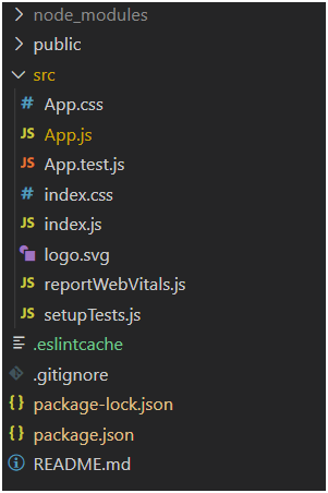
Project Structure: It looks like the below.
Project Structure
Example: Now, write the below code in the App.js file. Here, App is the default component where we wrote our code.
App.js
import React from 'react';
import 'bootstrap/dist/css/bootstrap.css';
import Carousel from 'react-bootstrap/Carousel';

export default function App() {
  return (
    <div style={{ display: 'block', width: 700, padding: 30 }}>
      <h4>React-Bootstrap Carousel Component</h4>
      <Carousel>
        <Carousel.Item interval={1500}>
          <img
            className="d-block w-100"
src=" https://www.javatpoint.com//wp-content/uploads/20210425122739/2-300x115.png"
            alt="Image One"
          />
          <Carousel.Caption>
            <h3>Label for first slide</h3>
            <p>Sample Text for Image One</p>
          </Carousel.Caption>
        </Carousel.Item>
        <Carousel.Item interval={500}>
          <img
            className="d-block w-100"
src="https://www.javatpoint.com//wp-content/uploads/20210425122716/1-300x115.png"
            alt="Image Two"
          />
          <Carousel.Caption>
            <h3>Label for second slide</h3>
            <p>Sample Text for Image Two</p>
          </Carousel.Caption>
        </Carousel.Item>
      </Carousel>
    </div>
  );
}
Steps to run the application: Run the applications by using the command from the root directory of the project:
npm start
Output: Open the browser and go to http://localhost:3000/. You will see the following output: